Navigation Menus
Add a responsive Bootstrap-styled table of contents to your HTML output.
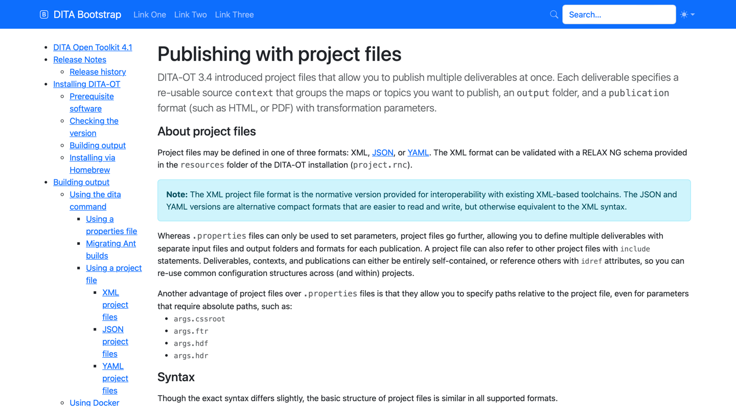
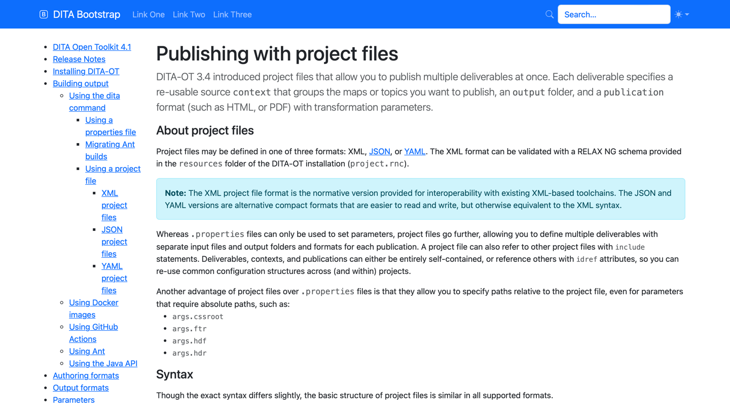
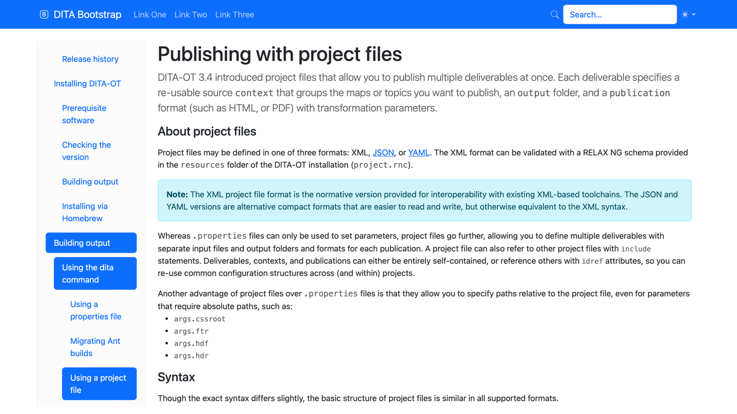
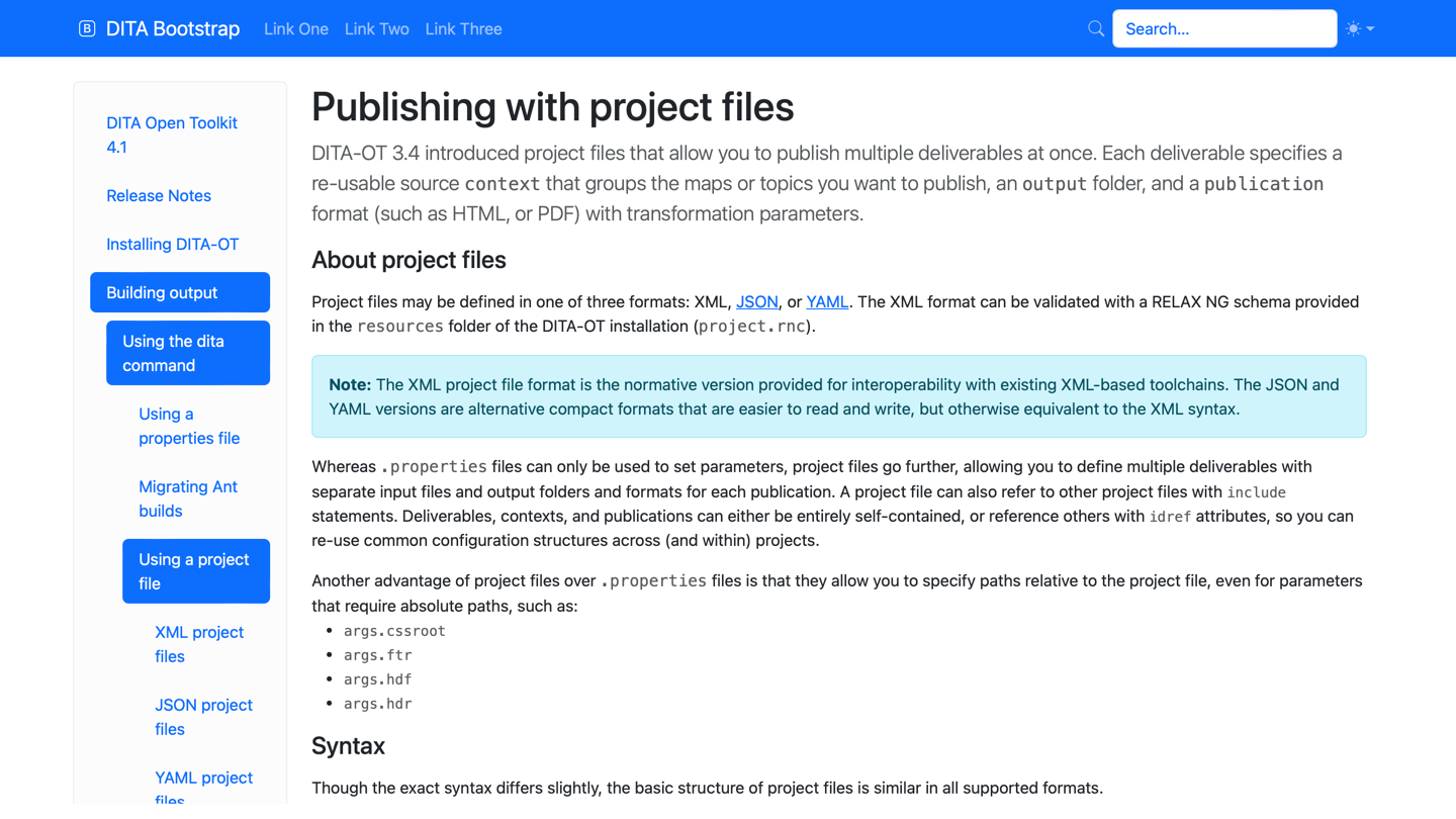
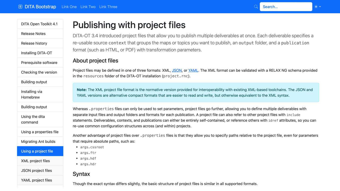
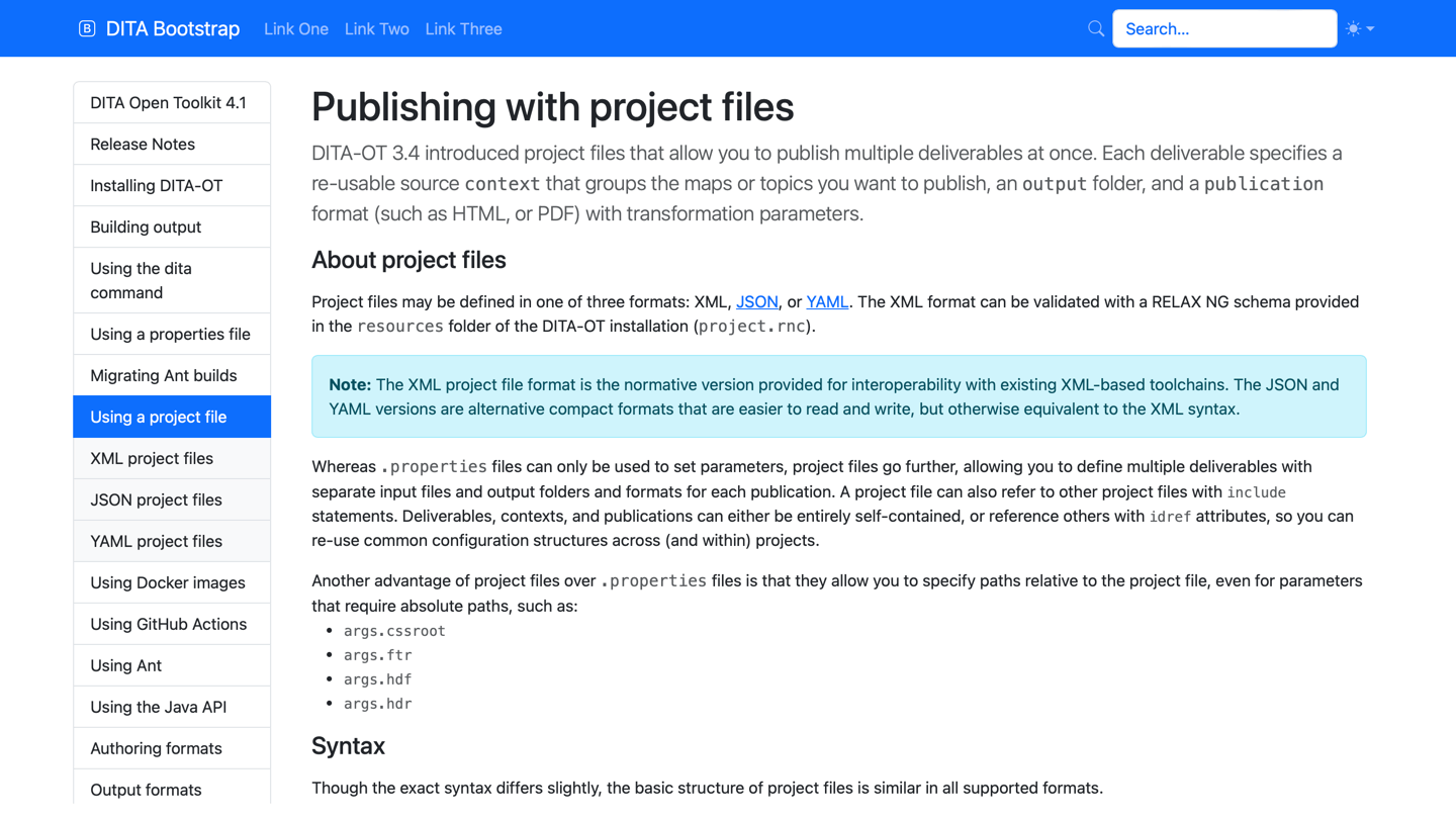
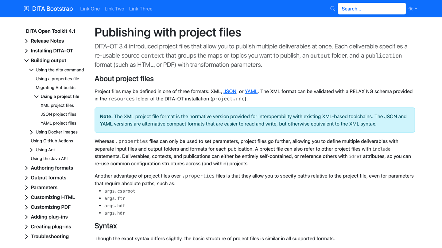
The sidebar is hidden by default on mobile. To ensure that the sidebar content can be accessed, the header file must include the following toggle with @data-bs-target="#bdSidebar"
and @data-bs-toggle="drawer":
<div class="bd-navbar-toggle">
<button class="lg:d-none p-2" type="button"
data-bs-toggle="drawer" data-bs-target="#bdSidebar"
aria-controls="bdSidebar" aria-label="Toggle docs navigation">
<i class="bi bi-list"/>
</button>
</div>The look and feel of the mobile sidebar header can be altered using the --bootstrap.sidebar.hdr parameter and supplying an HTML header file:
dita --input=path/to/your.ditamap \
     --format=html5-bootstrap \
--nav-toc=<sidebar-style> \
--bootstrap.sidebar.hdr=path/to/your.headerThe plug-in includes a sample header.
No footer is added to the sidebar by default, but a custom sidebar footer can be added using the --bootstrap.sidebar.ftr parameter and supplying an HTML footer file:
dita --input=path/to/your.ditamap \
  --format=html5-bootstrap \
  --nav-toc=<sidebar-style> \
  --bootstrap.sidebar.ftr=path/to/your.footer
The plug-in also includes a sample custom footer.
Menu bar
Additionally, the first-level navigation menu can be switched to a horizontal Bootstrap navbar to reduce the depth of the ToC. To use this option, add the --menubar-toc.include=yes parameter to the dita command:
dita --input=path/to/your.ditamap \
     --format=html5-bootstrap \
     --nav-toc=list-group-partial \
     --menubar-toc.include=yes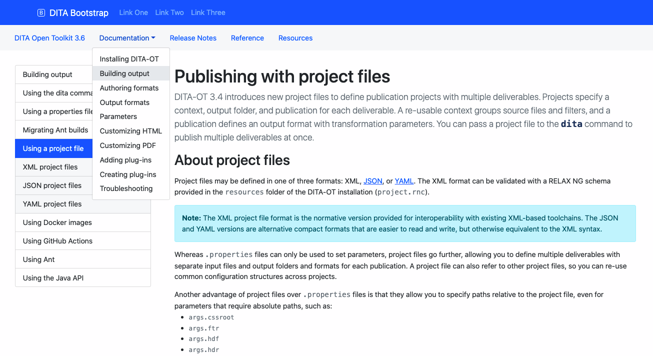
Top bar
A collapsible menu placed above the main menu can be included by adding the --bootstrap.topbar.hdr parameter to the dita command:
dita --input=path/to/your.ditamap \
     --format=html5-bootstrap \
     --nav-toc=<sidebar-style> \
     --bootstrap.topbar.hdr=path/to/your.header
The plug-in also includes a sample custom header.
<topicref navtitle="Search Box" format="dita" type="topic" href="search-box.dita">
  <topicmeta>
    <othermeta name="divider" content="Additional Plug-ins"/>
  </topicmeta>
</topicref>